The 40-hour app

My progress on publishing an app in 40 hours for both Android and iOS
The problem
I have a big, reactive dog. He is the most adorable potato at home, but when we go on walks, certain triggers make him bark. A lot. Besides training with a professional, I wanted a way to keep track of the dog’s most important events or activities to help me find links and ways to improve our life together. I know it sounds counterintuitive, but being a tech-person, I tried finding a non-app solution. It didn’t work. I tried and discarded the following tools:
- My memory: Probably the least reliable method. If negativity bias and recency bias weren’t enough, I also have a pretty bad memory.
- A notebook: I couldn’t keep up with the habit of sitting after each walk and to write it down what happened. Also, once the data was in written format, it’s very hard to process.
- Notion page: Data can be processed but… I had the same problem than the notebook, I found it really hard to create the habit of tracking everything.
The plan
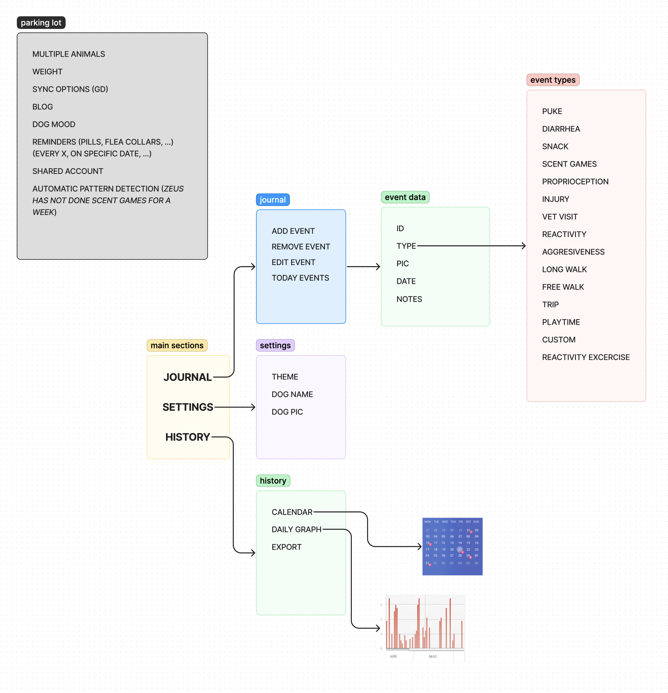
The more I thought about it, the more convinced I was to create an app. But I didn’t want to spend a lot of time on it, so no new technologies, no fancy UIs, just something to solve my problem and my problem only (others referred to this as playful programming which is a term I love). I started by drafting my main goals:
- To make it really easy to get my phone mid-walk and record something that happened, or I’m doing, with my dog.
- To be able to export all the data I collect in a format suitable for further processing.
- To focus only on me and my dog’s problem.
- To build it quickly.
After some consideration I asked myself: Why keeping it to myself? I’m pretty sure more people must be going through the same, so I included a 5th goal:
- To publish it.
The execution
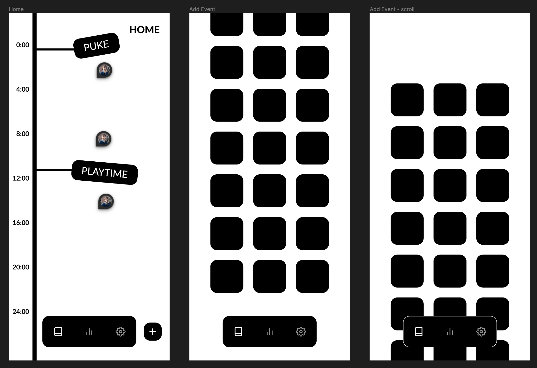
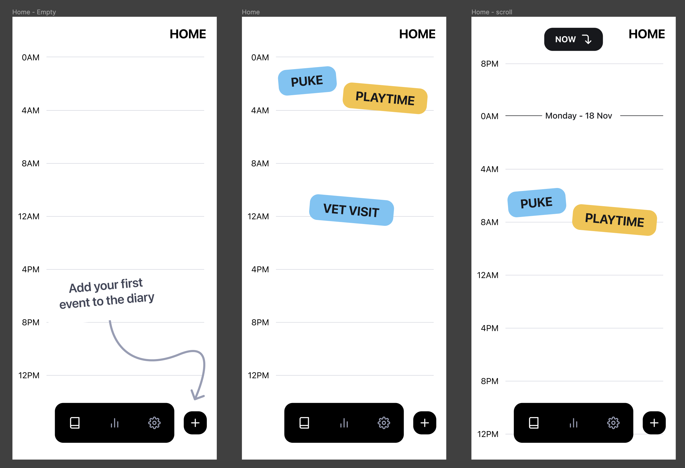
I started painting some screens and navigating the problem space, discovering the right information hierarchy that worked for me.

I wanted to keep the project light and fun, so I didn’t run a full exploration. My focus was not on finding the best way to represent events or deciding which icons I would use. Instead, I focused on having a good enough overall design. In other words, I aimed to find the first idea that was consistent and usable.

Once I determined the number of screens, user interactions, and overall design, I decided to add some personality. However, I didn’t conduct thorough research to find a color that wasn’t used by any competitor or define all the states of every button. My priority was to test the concept early rather than following all the steps in the book to create a design system.

With the most basic designs in hand, I jumped right into Expo + React Native. I won’t go into nitty details but I implemented almost everything in just a couple afternoons. There were some divergences from the designs here and there but I didn’t bother keeping them in sync, I knew that wouldn’t get me closer to publishing the app.
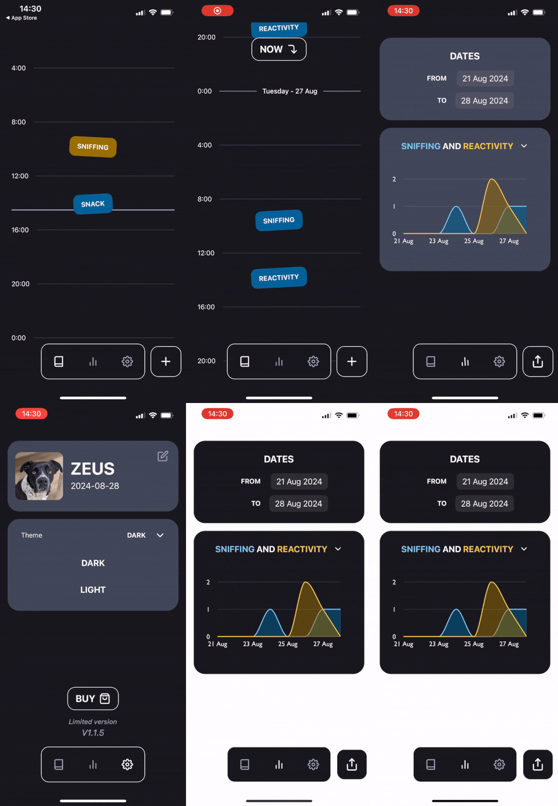
On the 40th hour, the app was published in both, the App Store and Google’s Play Store. The app is missing many features:
- It does not store data on any server, so if you delete the app, your data will be lost.
- It only displays a chart to identify potential relationships, but requires you to download all the data to delve deeper.
- It doesn’t allow you to create new customized events or include start/end times for a given event.
Despite the limitations, it perfectly suits my use case and, to me, there is no better solution.

The future of Trufario
As I said, all the original goals were met, including having the app in the stores (🎉). I have spent some more time on it to learn about specific features like in-app purchases or light/dark theme switching, but the core functionality has been untouched. I now have a lot of feedback from the app testers and even constant requests to turn this into catario (for cats) and, not surprisingly, babytario (yes, for human babies).
I haven’t decided if the app will continue evolving or not, but I know that I want to pursue the joy I felt while developing Trufario. From the sense of ownership, to the constant struggles (and later resolution) of the diverse problems I faced while creating the app.
The pains
- Switching hats: I had to switch roles frequently. Building things fast meant making mistakes. Lots of them. There was a constant struggle to keep everything synchronized that lasted just a day. Even so, I had to make numerous small decisions, and constantly switch between design and implementation, which ended up being both fun and exhausting.
- Play Store requirements: I always feared publishing anything in the App Store. There are a lot of requirements and the app has to be manually reviewed by someone in their team and it’s not uncommon for your app to be rejected. I thought Google’s Play Store was more lenient, but I was so wrong. As of November of 2023, Google changed their policies to force personal accounts to run a closed beta with 20 testers for 14 days. For indie developers like me, finding 20 volunteers to test the app was a true challenge (❤️ a huge thank you to all volunteers that came from guauful.com to test the app ❤️).
- Saying no (or later): To my surprise, there was a lot of interest in my app from testers. They provided invaluable feedback and ideas for improvement. However, I had to repeatedly prioritize and focus on solving my own problems before considering others’. I had to decline many interesting proposals. If this is seen as selfishness, it is because it is. But I also believe it has been a great way to test the plan, learn how to stay focused, and finish something.
The take-aways
- I found that leaving easy tasks for the next day helped a lot. Instead of becoming frustrated because I couldn’t solve something, I chose to do the opposite - leave a partially solved problem for the next day. When I returned to it, I felt ecstatic to finish what I had left unfinished. This approach may not work for everyone, and its effectiveness can depend on the context. However, for this project, it proved to be a great way to avoid gumption traps.
- I started the project believing that creativity sparked when there was a universe of possibilities but, to me, that only led to analysis-paralysis. I learned that enforcing constraints (even if they were silly, like not having any sort of remote storage for data) have allowed me to better explore a range of solutions I didn’t even consider at first.
- Finally, I’m going to reveal the big secret (you probably guessed it by now). It’s true it took me 40 hours to publish
the app, but that doesn’t mean it took me a week of work. The reality is that work spanned for over ~3 weeks. Working
few hours each day gave me truly interesting results:
- Focus: While working on the app, I found myself truly focused at the task at hand, even the ones I didn’t truly enjoy. Some call this to be in the zone and it has been extremely rare for me in the last year or so but with this project I was constantly flowing.
- Red work - Blue work: Having long pauses between work times allowed for my mind to explore alternatives, solutions and problems without me putting much effort into it.
- Satisfaction: Putting life (e.g. appointments, vet visits, breakfast with wifey etc) before work made the entire thing truly satisfying.